defined.
2022
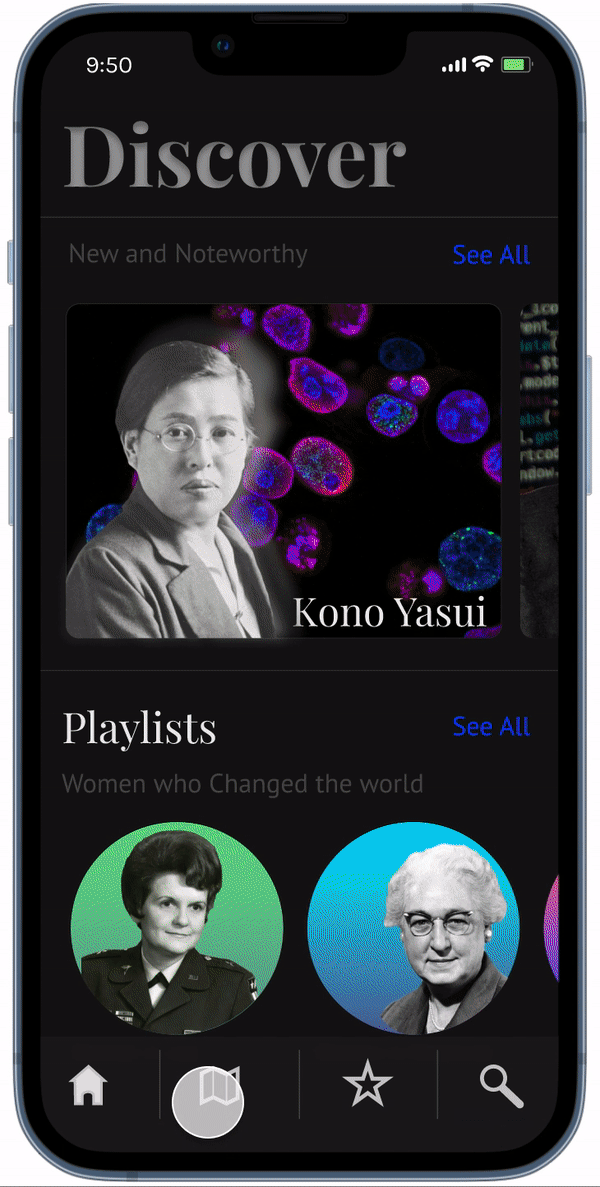
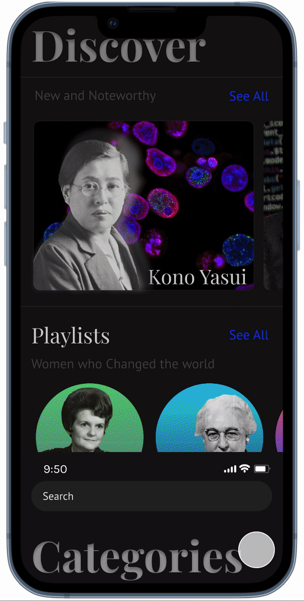
This application prototype was crafted from the CHI 2022 design challenge involving the theme of Gratitude. At the core of this design, I wanted to honor the legacy of someone who has moved on, in a very accessible way that promotes education and acceptance. This led to a hypothetical application where users can access Augmented Reality versions of prominent figures who are from underrepresented communities. This project is being updated regularly.
Scope
App Design
UI/UX Design
Figma
Heuristic Evaluation


Extensive research was conducted into the benefits of augmented reality in education as well as the lack of diversity in the western curriculum. Additional research into the prominent uses of Youtube and TicTok led to a more observational approach to these augmented reality profiles.
Icon doc: Exit, Favorite, Share, and Written Profile.

Camera display, with the augmented reality projection of the person in question. Life size with traditional dress.
Timeline toggle with pause and play button.
Display of the speech given by the profile, auto-scrolling as the speech moves along.
Initial mapping helped develop the core pages and features for this design. All features are crafted to get users to access profiles as quickly and inform discovery.


Inspiration for the LoFi architecture comes from popular music player catalogs like Spotify and Apple Music and commonly used digital maps like Google Maps and Apple Maps.
With similar design features to the aforementioned applications, there will be an advantage to user learnability, with a built-in sense of familiarity with the navigation design.
A persona was crafted from various academic papers around educators incorporating diversity in their teachings, observing the benefits, and discussing the pitfalls.

After a heuristic evaluation with a small number of users, I redesigned the interface to best match the feedback observed. Major comments regarding the prototype were that it was bland, lacked depth, but was easy to navigate. The addition of more ‘content’ and colorful styling led to the current prototype presented below.
Demonstration map location feature and profile view with AR.
Demonstration of the category search and view of a category page with sorting criteria.

Demonstration of the favorites page, where users can easily recall profiles and playlists they have saved.