Breadcrumbs
Client:
Role:
Year:
University Collge Dublin
UX & UI Designer
2022
The Problem
International students in Dublin faced significant "food insecurity" and cultural isolation due to the high cost of groceries and the difficulty of locating specific native ingredients in a foreign market.
The Solution
Breadcrumbs, a centralized mobile platform that combines a real-time price aggregator with a community-driven forum, allowing users to find affordable food and "crowdsource" the location of rare international items.
The Result
A research-backed, high-fidelity prototype that streamlined the search process, validated through testing with 15 users to ensure the navigation solved for the specific mental models of a diverse student body.


Research
Understanding the Ask
The challenge was to design a digital experience aimed at improving the daily lives of students at University College Dublin (UCD). Recognizing my own perspective as an international student, I wanted to ensure the solution was driven by evidence rather than personal or Western bias.
To remain objective, I began with a series of international interviews to identify the most significant friction points within the student experience.
Initial Interviews
While UCD hosts a diverse, global student body, my initial interviews revealed a recurring and primary pain point: Food Security and Accessibility.
International students, particularly those from Asian countries, expressed significant difficulty in sourcing affordable ingredients and finding specific items required for traditional home-cooked meals.
This cultural disconnect and the high cost of living in Dublin emerged as the central problem to solve.
International Student Survey
To validate these qualitative findings and gather broader data, I distributed a quantitative survey to international students across UCD, Trinity College, and Dublin City University (DCU).
The survey featured eight Likert-scale questions, two multiple-choice questions, and two open-response fields, all focused on the ease of price comparison and the availability of ethnic ingredients.


China, India, and Brazil were the largest international student populations in Ireland in 2021.
38% reported anxiety regarding food inflation and grocery pricing.
88% struggled to find specific ingredients necessary for their native cuisines.
74% relied on word-of-mouth recommendations from other international students to find reliable shops.
The Offical Idea
The data suggested that while price was a factor, the lack of centralized information was the greater hurdle. Students were manually crowdsourcing information from their peers. This led to the concept of Breadcrumbs: a centralized platform that aggregates grocery and market data across the city.
The application serves two purposes: an automated price-aggregator that scrapes local market data for deals, and a community-driven forum where users can "ping" the location of rare ingredients, effectively mapping the city's diverse culinary landscape.
Ideation
Idea Gathering
I audited the necessary feature set to ensure the app met the functional requirements identified in the research phase.
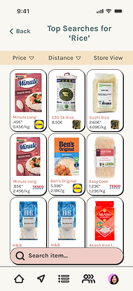
Item Search
-
View by item or store,
-
Price transparency,
-
Product descriptions
-
User reviews.
Community Forum
-
Q&A
-
Sharing posts.
Store Discovery
-
Map integration,
-
Distance filters,
-
User reviews.
Saved Lisits
-
Grocery lists
-
Store lists
-
Ingredient lists
Persona
I synthesized the survey data into a primary persona to guide my design decisions and maintain empathy for the end-user throughout the process.

Information Architecture
I mapped the user architecture to prioritize a "search-first" mentality. The goal was to minimize the time-to-value, allowing students to find specific ingredients or price comparisons with as few taps as possible.

Lo-Fi Wire Frames
Low-fidelity wireframes were developed to establish the information hierarchy. I focused on how to display complex data—such as fluctuating prices and store distances—without overwhelming the user interface.
Full Page Build

Sample WireFrames


User Testing
I conducted moderated usability testing with 15 international students using the low-fidelity prototype. Participants were tasked with finding specific items, editing profiles, and navigating the forum.
Critical Iterations:
Search Hierarchy
Testers confused "Item Search" with "Store Search." I moved the item search from an icon to an ever-present search bar right above the bottom nav.
Depending on the section, this search bar will hide when the function is not a priority.
Profile Consolidation
Moved "My Posts" into the profile section, as 13/15 testers went there first when trying to find them.
Navigation Realignment
I integrated a "Nearby" icon into the navigation so users can quickly see what is around them and search for stores. This helped alleviate the store and item search confusion.
Store Layout
Reorganized the individual store pages to display inventory first, as testers expressed interest in item availability over store descriptions.
Branding
The name "Breadcrumbs" was chosen as a metaphor for the age-old tale of leaving a trail to find one's way home—in this case, using food as the path to cultural connection.
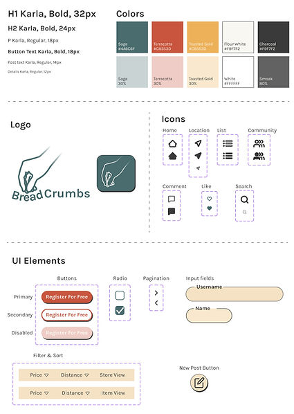
Color Palette
Inspired by universal spices and raw ingredients (turmeric, charcoal, flour). These muted, earthy tones allow the colorful product photography to remain the focal point.
Typography
I selected Karla, a grotesque sans-serif, for its high legibility and friendly, modern aesthetic.
Design System
The UI blends the efficiency of modern e-commerce with the organic, approachable feel of an open-air market.


The Result
Building Breadcrumbs from the ground up provided invaluable insights into the end-to-end UX process:
Designing for Diversity
I learned to check my Western biases by letting data from marginalized user groups lead the feature set.
Iterative Refinement
The usability testing proved that what seems intuitive to a designer may not be clear to a user in a high-stress or unfamiliar environment.
Systemic Complexity
Understanding the intricacies of "interactability"—how one small change in the nav bar ripples through the entire user flow.
Future Considerations
To take this to a production-ready level, I would focus on designing for edge cases, including robust error states and "no results found" screens.
Additionally, I plan to explore motion design to create smoother transitions and loading states that keep the user informed of the app's status during data scraping.