CubeSmart's Brand Standards Site
Client:
Role:
Year:
CubeSmart, LLC
UX & UI Designer
2025
The Problem
CubeSmart needed a more efficient way to share its brand standards with both internal teams and external partners. The existing method—a static, 54-page PDF—was cumbersome, difficult to navigate, and prone to versioning confusion and misplacement. This outdated process created a significant obstacle to maintaining a consistent brand identity across all platforms.
The Solution
The solution was to transform this dense, manual document into a dynamic, accessible, and intuitive online resource. Oh, the timeline? I had two months from creation to launch to meet a National Meeting deadline.
The Result
The launch of the new digital brand guidelines has had a significant positive impact as it has become the single source of truth for the CubeSmart brand, fostering greater consistency and clarity. This project led to a significant decrease (~64%) in questions to the marketing team regarding branding.


Research
Stakeholder Interviews
Since the brand effects all areas of the organization, I began by conducting stakeholder interviews across a variety of departments to identify the most critical information within the existing PDF. I asked open-ended questions like "What is useful," "What is useless," and "What is missing". This helped inform what information most important to the end user and how they need to access it.
The following commonalities took shape.
Font & colors
Be clear on what fonts to use in differing situations (printed materials vs. website vs. Microsoft Word). Define the primary color palette, as well as secondary/tertiary for situations requiring extended color use.
Do's & Dont's
Include what to avoid as far as logo treatments, messaging, and visuals.
Resource Guide
There should be links to branded documents and training materials for teammates to use.
Tone & Lingo
When it comes to verbally or behaviorally representing the brand, content should be friendly to new hires, and be clear on what is/isn’t acceptable.
Brand Guideline & Standard Research
To benchmark best practices, I researched digital brand guidelines from a diverse range of companies, including competitors like ExtraSpace and unrelated brands such as SeatGeek, DevRev, and Starbucks. This research provided valuable insights into effective navigation, interactive elements for showing color variants, and innovative ways to communicate brand voice and visual style.
Key Elements to include in the design:
Simple Navigation
Visuals to accompany text when appropriate
"Last Updated" status
Links to assets & documents
Password protect sensitive information.
SeatGeek
SeatGeek has a very simplistic left side navigation as well as a click to copy hex codes.

Starbucks
Starbucks leans into simplicity, with easy to understand visuals through interaction.

Persona
Since this digital experience is used by every department in some capacity, I focused on the commonalities of those who will be using this document the most.
Internal Desktop users with little to no branding experience.

Ideation
Site Map
I focused on creating an intuitive information architecture that would guide users seamlessly through the brand elements. I started with the same structure as the PDF, but needed to add pages after undergoing user tests (details below).

Design Strategy
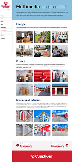
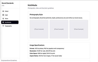
The core design principle became “show, don’t tell.”
This approach allowed me to communicate complex guidelines with simple, impactful visuals, condensing pages of information into easily digestible interactive content.
Having users interact with the content requires active learning, which engages multiple senses and parts of the brain for better retention.


Content
Since the content was already provided in the original PDF document, I worked with the content strategist to create short energizing summaries for each section that was brand forward.
"CubeSmart’s brand palette conveys our top differentiators—customer service, cleanliness, and security. We lead with Brand Red as a warm, energetic, and action oriented color. Red takes center stage by surrounding it with neutrals including grey, white, and muted companions colors, like Accent Blue."
Lo-Fi Wire Frames
After I began by defining the main user task and flow, then created the first set of low-fidelity wireframes to run preliminary tests with users.


User Testing
To validate the design, I conducted moderated user tests with 11 internal teammates who are the typical primary users. I created a series of tasks where participants had to find specific information with minimal assistance. I carefully observed their navigation paths, tracked task completion times, and noted any points of frustration.
The user testing revealed critical areas for improvement.
Adjust IA
The "Icons" and "Stores" sections needed their own dedicated tabs to be more easily discoverable.

Easier Navigation
There was a need anchor links acting as page descriptors; helping with navigating pages with multiple sections.

Branding
The branding used CubeSmart's colors and fonts, established in the brand standards. Since this is a digital medium, I did incorporate their web style kit for headings, paragraphs, and buttons.

Hi-Fidelity Prototype
This prototype was used as the blueprint to build the real brand standards using Standards.com. Some design elements needed to change due to the platform's limitations.


The Result
With only two months to complete, I was able to launch CubeSmart's Brand Standards one week early!
The launch of the new digital brand guidelines has had a significant positive impact as it has become the single source of truth for the CubeSmart brand, fostering greater consistency and clarity.
This streamlined, accessible platform has not only boosted brand awareness but has also empowered both internal teams and external partners to represent the brand accurately and effectively.
~64%
Decrease in branding related questions in the first month of deployment.
707
Visitors in the first month of deployment.